Kitchen Color Schemes That Stand the Test of Time: Creating Beauty That Lasts
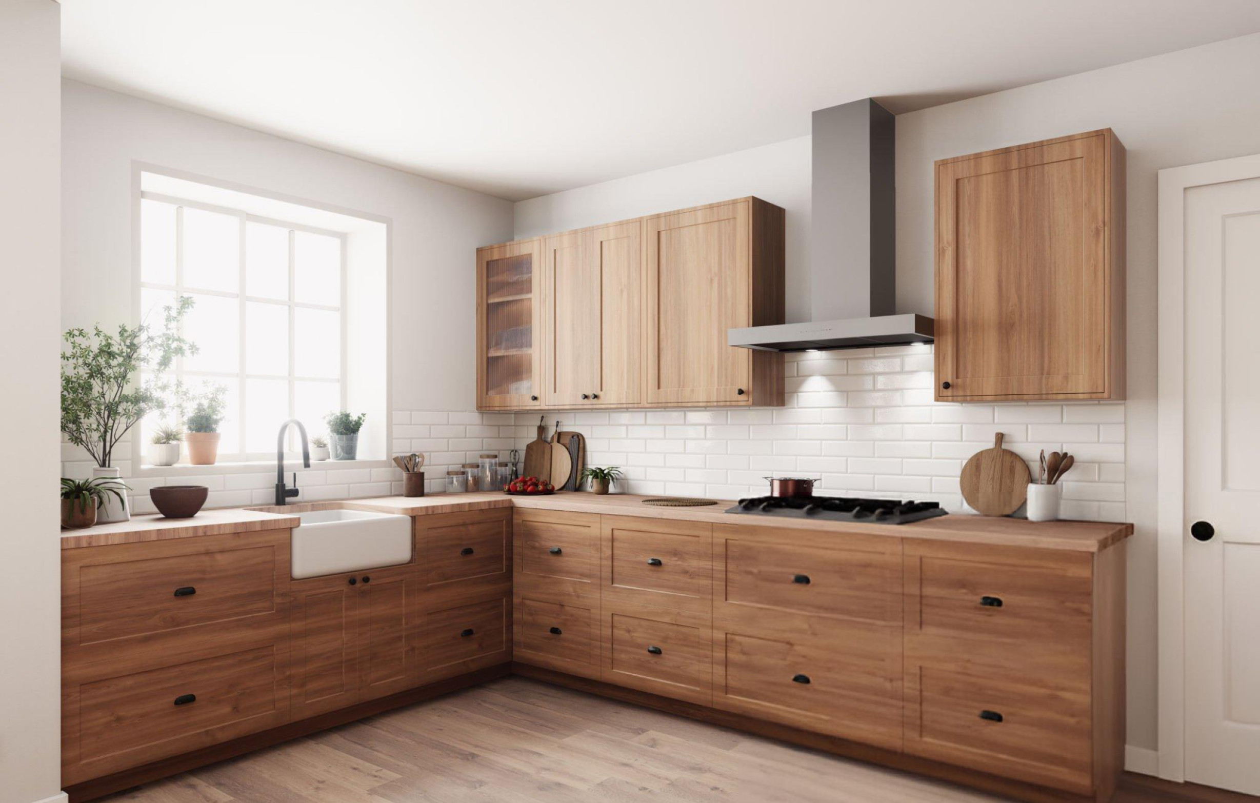
Choosing the right color scheme for your kitchen renovation represents one of the most important decisions you’ll make, as these colors will surround you daily for many years to come. While trendy colors might look appealing in magazines or on social media, the most successful kitchen color schemes are those that maintain their appeal across decades and design movements. Understanding which colors have proven their staying power helps you create a kitchen that feels fresh and current while avoiding the regret that comes with choices that quickly look dated. Timeless kitchen color schemes work because they’re based on natural color relationships and classic combinations that appeal to human psychology rather than temporary fashion trends. These color choices provide a foundation that works with various decorating styles while allowing flexibility to update accents and accessories as your preferences evolve over time. The Psychology Behind Lasting Color Appeal Certain colors have maintained their popularity in kitchens because they address fundamental human needs and preferences that transcend temporary style movements. Understanding why these colors work helps you make choices that will satisfy you for years to come. Neutral colors create calming environments that reduce stress and promote relaxation, essential qualities in kitchens where families gather and daily routines unfold. Colors like white, cream, gray, and beige provide a sense of cleanliness and order that feels appropriate for food preparation spaces. Natural color relationships found in nature tend to feel harmonious and comfortable over long periods. Earth tones, sky blues, and plant greens connect us to the natural world in ways that feel inherently pleasing and restful. Light colors make spaces feel larger and brighter, particularly important in kitchens where good lighting and spacious feelings improve both function and comfort. Light color schemes also reflect natural and artificial light better, creating more pleasant working environments. Warm colors promote appetite and social interaction, making them naturally suited to kitchen environments where families share meals and gather for conversation. However, the most successful warm colors are muted rather than intense, providing comfort without overwhelming. Cool colors can provide balance and sophistication when used appropriately, though they work best in combination with warmer accents to prevent kitchens from feeling cold or unwelcoming. Classic color combinations that have appeared throughout design history continue to work because they’re based on fundamental color theory principles rather than temporary preferences. White: The Ultimate Timeless Choice White remains the most enduring kitchen color choice because it provides a clean, fresh foundation that works with virtually any design style while making kitchens feel larger and brighter. However, successful white kitchens require careful attention to texture, lighting, and accent colors to avoid feeling sterile. Pure white works best in kitchens with excellent natural light and varied textures that add visual interest. Smooth white cabinets, textured white subway tiles, and white quartz countertops with subtle veining create depth while maintaining the clean white aesthetic. Warm whites with undertones of cream or yellow feel more inviting than stark, cool whites, particularly in kitchens with limited natural light. These warmer whites provide the benefits of white while feeling more comfortable and livable. Off-white variations like ivory, cream, and antique white offer sophistication and warmth while maintaining the spacious feeling that makes white so popular. These colors work particularly well in traditional and transitional kitchen designs. White combinations with natural materials like wood and stone create balance and prevent all-white kitchens from feeling cold or institutional. Natural wood islands, stone countertops, or wood flooring add warmth while maintaining white’s fresh appeal. Textural variety becomes crucial in white kitchens to create visual interest without color contrast. Mixing matte and glossy finishes, smooth and textured surfaces, and different white tones adds depth while maintaining color harmony. Accent flexibility represents white’s greatest advantage, as virtually any accent color works with white foundations. You can change hardware, lighting, textiles, and accessories to update your kitchen’s personality without changing the fundamental color scheme. Gray: Modern Sophistication with Staying Power Gray has proven its lasting appeal as a sophisticated neutral that provides more visual interest than white while maintaining the versatility and timeless quality that makes for successful long-term color choices. Light grays offer similar space-enhancing qualities to white while providing subtle color that adds sophistication and reduces the stark appearance that some people find uncomfortable in all-white kitchens. Medium grays provide excellent background colors that highlight both warm and cool accent colors while maintaining neutral sophistication. These grays work particularly well in contemporary and transitional kitchen designs. Charcoal and dark grays create dramatic, sophisticated looks when used carefully, particularly effective on kitchen islands or lower cabinets balanced with lighter colors on upper cabinets and walls. Gray undertones matter significantly in how the color feels over time. Blue-gray feels cool and contemporary, while greige (gray with beige undertones) provides warmth that many families find more comfortable for daily living. Gray combinations work beautifully with white for classic two-tone looks, with natural wood for warmth, or with bold accent colors for personality. This versatility helps gray kitchens adapt to changing preferences over time. Natural light affects gray significantly, so it’s important to test gray paint colors in your specific kitchen lighting conditions before making final decisions. What looks perfect in a paint store may appear different in your kitchen’s unique lighting. Cream and Warm Neutrals: Comfort That Endures Cream, beige, and other warm neutrals have maintained their appeal because they provide the space-enhancing benefits of light colors while offering warmth and comfort that pure white sometimes lacks. Cream cabinets offer a softer alternative to white that works beautifully with both traditional and contemporary design styles. The subtle warmth prevents the sterile feeling that stark white can create while maintaining classic appeal. Beige tones provide sophisticated neutrals that complement a wide range of accent colors and decorating styles. Quality beige paint colors offer depth and richness that cheap alternatives often lack. Warm gray-beige combinations (greige) have become popular because they offer the sophistication of gray with the warmth of beige, creating colors that feel both