Kitchen Color Schemes That Stand the Test of Time: Creating Beauty That Lasts
Choosing the right color scheme for your kitchen renovation represents one of the most important decisions you’ll make, as these colors will surround you daily for many years to come. While trendy colors might look appealing in magazines or on social media, the most successful kitchen color schemes are those that maintain their appeal across decades and design movements. Understanding which colors have proven their staying power helps you create a kitchen that feels fresh and current while avoiding the regret that comes with choices that quickly look dated.
Timeless kitchen color schemes work because they’re based on natural color relationships and classic combinations that appeal to human psychology rather than temporary fashion trends. These color choices provide a foundation that works with various decorating styles while allowing flexibility to update accents and accessories as your preferences evolve over time.
The Psychology Behind Lasting Color Appeal
Certain colors have maintained their popularity in kitchens because they address fundamental human needs and preferences that transcend temporary style movements. Understanding why these colors work helps you make choices that will satisfy you for years to come.
Neutral colors create calming environments that reduce stress and promote relaxation, essential qualities in kitchens where families gather and daily routines unfold. Colors like white, cream, gray, and beige provide a sense of cleanliness and order that feels appropriate for food preparation spaces.
Natural color relationships found in nature tend to feel harmonious and comfortable over long periods. Earth tones, sky blues, and plant greens connect us to the natural world in ways that feel inherently pleasing and restful.
Light colors make spaces feel larger and brighter, particularly important in kitchens where good lighting and spacious feelings improve both function and comfort. Light color schemes also reflect natural and artificial light better, creating more pleasant working environments.
Warm colors promote appetite and social interaction, making them naturally suited to kitchen environments where families share meals and gather for conversation. However, the most successful warm colors are muted rather than intense, providing comfort without overwhelming.
Cool colors can provide balance and sophistication when used appropriately, though they work best in combination with warmer accents to prevent kitchens from feeling cold or unwelcoming.
Classic color combinations that have appeared throughout design history continue to work because they’re based on fundamental color theory principles rather than temporary preferences.
White: The Ultimate Timeless Choice
White remains the most enduring kitchen color choice because it provides a clean, fresh foundation that works with virtually any design style while making kitchens feel larger and brighter. However, successful white kitchens require careful attention to texture, lighting, and accent colors to avoid feeling sterile.
Pure white works best in kitchens with excellent natural light and varied textures that add visual interest. Smooth white cabinets, textured white subway tiles, and white quartz countertops with subtle veining create depth while maintaining the clean white aesthetic.
Warm whites with undertones of cream or yellow feel more inviting than stark, cool whites, particularly in kitchens with limited natural light. These warmer whites provide the benefits of white while feeling more comfortable and livable.
Off-white variations like ivory, cream, and antique white offer sophistication and warmth while maintaining the spacious feeling that makes white so popular. These colors work particularly well in traditional and transitional kitchen designs.
White combinations with natural materials like wood and stone create balance and prevent all-white kitchens from feeling cold or institutional. Natural wood islands, stone countertops, or wood flooring add warmth while maintaining white’s fresh appeal.
Textural variety becomes crucial in white kitchens to create visual interest without color contrast. Mixing matte and glossy finishes, smooth and textured surfaces, and different white tones adds depth while maintaining color harmony.
Accent flexibility represents white’s greatest advantage, as virtually any accent color works with white foundations. You can change hardware, lighting, textiles, and accessories to update your kitchen’s personality without changing the fundamental color scheme.
Gray: Modern Sophistication with Staying Power
Gray has proven its lasting appeal as a sophisticated neutral that provides more visual interest than white while maintaining the versatility and timeless quality that makes for successful long-term color choices.
Light grays offer similar space-enhancing qualities to white while providing subtle color that adds sophistication and reduces the stark appearance that some people find uncomfortable in all-white kitchens.
Medium grays provide excellent background colors that highlight both warm and cool accent colors while maintaining neutral sophistication. These grays work particularly well in contemporary and transitional kitchen designs.
Charcoal and dark grays create dramatic, sophisticated looks when used carefully, particularly effective on kitchen islands or lower cabinets balanced with lighter colors on upper cabinets and walls.
Gray undertones matter significantly in how the color feels over time. Blue-gray feels cool and contemporary, while greige (gray with beige undertones) provides warmth that many families find more comfortable for daily living.
Gray combinations work beautifully with white for classic two-tone looks, with natural wood for warmth, or with bold accent colors for personality. This versatility helps gray kitchens adapt to changing preferences over time.
Natural light affects gray significantly, so it’s important to test gray paint colors in your specific kitchen lighting conditions before making final decisions. What looks perfect in a paint store may appear different in your kitchen’s unique lighting.
Cream and Warm Neutrals: Comfort That Endures
Cream, beige, and other warm neutrals have maintained their appeal because they provide the space-enhancing benefits of light colors while offering warmth and comfort that pure white sometimes lacks.
Cream cabinets offer a softer alternative to white that works beautifully with both traditional and contemporary design styles. The subtle warmth prevents the sterile feeling that stark white can create while maintaining classic appeal.
Beige tones provide sophisticated neutrals that complement a wide range of accent colors and decorating styles. Quality beige paint colors offer depth and richness that cheap alternatives often lack.
Warm gray-beige combinations (greige) have become popular because they offer the sophistication of gray with the warmth of beige, creating colors that feel both current and comfortable.
Natural material coordination works particularly well with warm neutrals, as these colors complement wood, stone, and other organic materials naturally. This harmony creates kitchens that feel collected and comfortable rather than forced.
Lighting considerations become important with warm neutrals, as these colors can appear yellow or muddy in poor lighting conditions. Good lighting design enhances warm neutrals while preventing them from looking dingy.
Accent flexibility allows warm neutral foundations to work with seasonal decorating changes, different metal finishes, and various accent colors as preferences evolve over time.
Classic Two-Tone Combinations
Two-tone kitchen color schemes provide visual interest while maintaining timeless appeal through classic color relationships that have proven their staying power across different design eras.
White and navy blue creates a crisp, classic combination that feels both traditional and contemporary. Navy lower cabinets with white upper cabinets provide grounding while maintaining an open feeling.
White and natural wood offers warmth and texture contrast while maintaining the fresh, clean appeal that makes white kitchens so enduring. This combination works with both painted and stained wood finishes.
Gray and white provides subtle contrast that adds visual interest without dramatic color changes. This combination allows for various gray intensities while maintaining sophisticated neutrality.
Cream and sage green creates a soft, natural combination that feels calming and timeless. This pairing works particularly well in traditional and farmhouse-style kitchens.
Two-tone applications typically work best with darker colors on lower cabinets and lighter colors on upper cabinets, creating visual weight distribution that feels natural and balanced.
Transition considerations between the two colors should feel intentional rather than abrupt. Crown molding, trim details, or natural breaking points help two-tone combinations feel cohesive rather than disconnected.
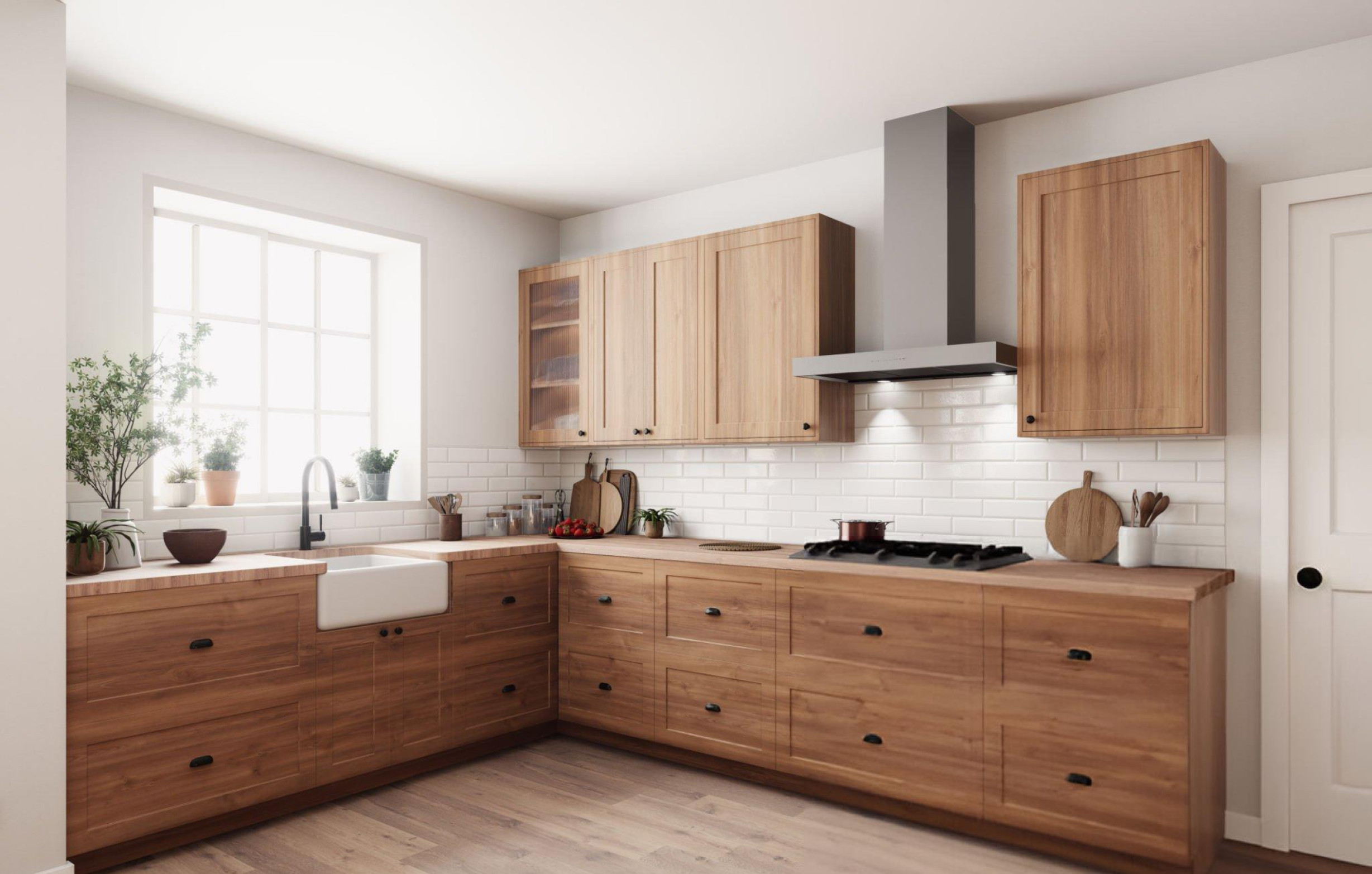
Natural Wood Tones: Warmth That Never Goes Out of Style
Natural wood brings organic warmth and character to kitchens while providing timeless appeal that works across many design styles and time periods. The key is choosing wood tones and finishes that complement rather than compete with other kitchen elements.
Light wood tones like maple, birch, and light oak provide warmth without overwhelming other design elements. These woods work particularly well in smaller kitchens where darker woods might feel heavy.
Medium wood tones including cherry, walnut, and medium oak offer rich warmth and character that serve as beautiful focal points in kitchen designs. These woods age gracefully while developing character over time.
Dark woods like espresso-stained oak or natural walnut create dramatic, sophisticated looks when balanced with lighter colors elsewhere in the kitchen. These rich tones work particularly well on kitchen islands or as accent elements.
Natural versus stained finishes each offer different benefits. Natural finishes showcase wood’s inherent beauty while stained finishes allow customization to match specific design visions.
Wood combinations with painted cabinets create interesting contrast while maintaining warmth. Painted perimeter cabinets with a natural wood island provide the best of both approaches.
Maintenance considerations vary with different wood types and finishes, but most kitchen wood finishes are designed to handle normal kitchen conditions with appropriate care.
Soft, Muted Colors That Add Personality
While neutrals form the foundation of timeless color schemes, soft, muted colors can add personality while maintaining long-term appeal when chosen carefully and applied thoughtfully.
Sage green provides natural, calming color that complements both traditional and contemporary kitchen designs. This muted green works particularly well with white, cream, and natural wood accents.
Soft blue offers serenity and sophistication when used in muted tones rather than bright, intense blues that may feel dated quickly. Powder blue and gray-blue provide color without overwhelming.
Warm taupe combines the neutrality of beige with subtle color that adds sophistication without dramatic statements. This color works particularly well in kitchens with natural stone and wood elements.
Dusty pink or blush tones can add warmth and femininity when used subtly, particularly effective as accent colors rather than dominant hues that might feel too bold over time.
Soft lavender provides subtle color that feels sophisticated rather than overwhelming, working particularly well in kitchens with traditional or cottage-style design elements.
Application strategies for muted colors often work best on single elements like islands, accent walls, or upper cabinets rather than throughout the entire kitchen where they might feel overwhelming over time.
Colors to Approach with Caution
While personal preference matters in color selection, certain colors have proven more likely to feel dated or problematic over time, making them worth careful consideration before permanent application.
Bold, bright colors often lose their appeal more quickly than muted alternatives. Bright red, electric blue, or vivid green may feel exciting initially but can become tiresome or dated as trends change.
Very dark colors throughout kitchens can make spaces feel smaller and gloomier, particularly problematic in kitchens with limited natural light. Dark colors work better as accents than dominant themes.
Colors that are strongly associated with specific time periods may date your kitchen to that era. Avocado green and harvest gold clearly indicate 1970s design, while certain purple tones suggest 1980s styling.
Trendy colors that are heavily promoted in current design media should be considered carefully, as their popularity may be fleeting rather than lasting.
Colors that photograph well but are difficult to live with daily may lose their appeal quickly. Some colors look great in magazines but feel uncomfortable in real-life daily use.
Very cool color schemes without warm accents can feel unwelcoming in kitchen environments where warmth and comfort are important for family gathering and meal preparation.
Implementing Timeless Color Schemes Successfully
Successful implementation of timeless color schemes requires attention to proportions, lighting, and integration with other kitchen elements to create cohesive, lasting beauty.
Color distribution should follow classic proportions with dominant neutrals, secondary colors in smaller amounts, and accent colors used sparingly for interest without overwhelm.
Lighting design significantly affects how colors appear and feel in your kitchen. Test paint colors under both natural and artificial lighting conditions before making final decisions.
Quality paint and finishes make substantial differences in how colors look and wear over time. Investment in high-quality materials protects your color choices while ensuring better durability.
Integration with fixed elements like countertops, flooring, and backsplashes requires careful coordination to ensure all elements work harmoniously rather than competing for attention.
Flexibility planning allows for future updates through easily changeable elements like hardware, lighting, and accessories while maintaining the timeless foundation colors.
Sample testing in your actual kitchen space prevents costly mistakes by showing how colors look in your specific lighting and spatial conditions rather than relying on small paint chips.
Accent Colors and Seasonal Updates
Timeless foundation colors provide the perfect backdrop for accent colors that can change with seasons, trends, or personal preferences without requiring major renovation investments.
Hardware finishes like cabinet pulls and faucets can introduce metallic accents that update your kitchen’s personality. Brass, copper, black, and stainless steel each create different moods with the same foundation colors.
Lighting fixtures offer opportunities to introduce accent colors or interesting materials that complement your timeless color scheme while providing personality and style updates.
Textiles including window treatments, rugs, and seat cushions allow seasonal color changes that keep your kitchen feeling fresh while maintaining the foundational color investment.
Artwork and decorative accessories provide the most flexible way to introduce accent colors, allowing you to experiment with trends or seasonal preferences without permanent commitments.
Plant life brings natural green accents that complement virtually any timeless color scheme while adding life and freshness to kitchen environments.
Backsplash elements can introduce pattern and accent colors while remaining relatively affordable to update if preferences change, though choosing timeless options here also provides long-term value.
Budget Considerations for Timeless Color Choices
Investing in timeless color schemes often provides better long-term value than following trends that may require updates in just a few years.
Quality paint costs more initially but provides better coverage, durability, and color retention that protects your investment over time. Cheap paint often requires more frequent repainting and may not achieve true color representation.
Neutral foundations allow you to invest in quality materials for major elements while updating personality through less expensive accent elements that can change over time.
Professional color consultation can prevent costly mistakes when making major color decisions, particularly valuable when coordinating multiple elements and finishes.
Timing considerations suggest implementing timeless color schemes during major renovations when you’re already investing in cabinets, countertops, and other major elements that benefit from cohesive color planning.
Resale value often benefits from timeless color choices that appeal to broader markets rather than personal preferences that might limit buyer appeal.
Creating Your Timeless Color Strategy
Developing a successful timeless color scheme requires understanding your space, lifestyle, and long-term goals while balancing personal preferences with proven color principles.
Assess your kitchen’s natural light, size, and architectural features to understand which color approaches will work best in your specific space.
Consider your family’s lifestyle and how you use your kitchen to determine whether you prefer energizing or calming color schemes, formal or casual atmospheres.
Plan for longevity by choosing foundation colors you genuinely love rather than settling for safe choices that don’t inspire you, while ensuring those preferences align with timeless principles.
Test thoroughly by living with paint samples and material samples for several days under different lighting conditions before making final commitments.
Coordinate systematically with all kitchen elements including cabinets, countertops, flooring, and appliances to ensure cohesive results rather than piecemeal color decisions.
The most successful timeless kitchen color schemes balance proven color principles with personal preferences, creating spaces that feel both current and enduring while supporting your family’s daily life and long-term satisfaction.